In 2020, more 50% of the world’s population access the web from their mobile devices. As mobile access grows by the hour, so does the number of people who require a mobile-friendly website. Companies today can no longer get away with designing for desktop users only and must learn to adapt. If you do not have a site compatible with mobile devices, a primary sales touch-point in the sales funnel, it is pretty much guaranteed you will exponentially lose competitiveness and thus customers and revenues. Fortunately, there is a solution. By implementing a mobile-first website, you can capture all the customers and leads that you otherwise would have lost to your competitors.
Choose your design.
Before you start building your mobile site, you need to choose how you will design your site, both desktop and mobile should be looked at as separate yet complimenting digital assets.
There are two common design approaches…
- Responsive web design: A responsive web design uses adaptable layouts, which means you can have a website that appears almost the same on desktop, mobile, and tablet devices. Your content and your design adapt itself to a user’s device automatically.
- Mobile-first/Adaptive web design: A Mobile-first design is exactly as it sounds: sketching, prototyping, and designing for mobile first and then scaling up to larger screens from there. Mobile-first ensures that you deliver the right User Experience (UX) to the right screen. This approach uses a unique layout for mobile devices.
I highly encourage using a Digital Agency.
The value of using a Digital Agency…
A digital agency can also help your company launch an attractive and easy-to-use website. The advantage of partnering with a web design agency, however, is that you often get access to a team of designers and developers, which can make a massive difference in the look and speed of your site. In most cases, established web design agencies can also offer lower rates than professional web designers. That is because they feature the necessary talent to create and build mobile websites fast, which allows them to take on additional projects.
If you decide to partner with a web design agency, follow an approach like hiring a web designer. Request a custom quote, browse their portfolio, and meet with their team to see how they can help your company build a mobile website that generates sales and phone calls. Once you decide how to build a mobile website, whether with a designer, agency, or website builder, you can begin the process. Remember to research each option in-depth. That way, your business can make the best decision for your site, budget, and ideal website visitor.
Start building your mobile design.
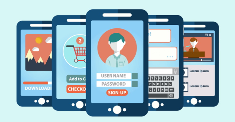
As you begin creating your mobile website, remember these key best practices for mobile sites:
- Keep the visuals captivating: Users on mobile devices are likely to leave your website due to distractions. It’s therefore crucial that you use images that are attention-grabbing, vivid and impressive. (But note, image files cannot be too large or this slow down the speed of your site).
- Prioritize contact information: Research clearly shows that obvious, easy to access contact information increases leads. A good way to do this is to include live chat and large contact clickable links (forms, email and linkable phone numbers) on your mobile website.
- Keep the design simple: Simplicity is key. When accessing a mobile device, users use their fingers vs to a precise cursor, so do not include trendy desktop features such as pop-ups. It is also critical that everything is simply accessible, as the website should accommodate people using their phone single handed.
- Make sure that your mobile site has a quick load- time: Users are much more distracted and likely to bounce when using mobile devices in comparison to desktops. This means that the performance of your mobile website is essential. The connection speed should be speedy, and the links should work properly to give the user an enjoyable and straightforward experience, which will, in turn, reduce bounce rate and improve conversions. It should be noted that 47% of consumers expect a web page to load in under 2 seconds!
- Test before you launch the finalized version of your mobile site: Make sure you test thoroughly. You want to provide website visitors with a seamless experience, and if they run into issues, they may not bother coming back.
The payoff is big-time! Google ranks fast-loading sites higher in SERPS. It also uses mobile compatibility as a ranking signal for your site. Even though improved search rankings most likely will not happen overnight, your users will notice immediately. Without an effective well-designed mobile website, you stand to lose more than half of your potential online customers. That means you are only earning 50% of what you should be! That is why companies (including your competitors) are researching how to create a successful mobile website. More than ever, online shoppers are turning to their mobile devices to access localized information and to purchase products/ services. By the end of this year, 2020, the mobile e-Commerce amount is set to reach well over $700 billion in spending.
Have I convinced you that a well designed mobile website is super important?
There hundreds more pages more I could write on the critical importance of mobile design to sustained competitive advantage. I will say this, if you are not making this a digital marketing priority, you are losing the long game. Providing an effortless experience for users on your website is the priority, by designing with the user experience in mind you are making sure your customers have a fulfilling experience.